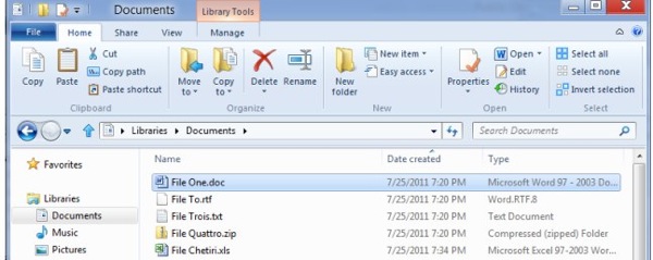
The initial reaction to Microsoft’s unveiling of the Ribbon in Windows 8’s Explorer.exe has mostly been sour. Â Of course, most of these people are using Macs and they see this as an over-complication of the UI. Â Those defending Windows accuse Apple of “dumbing down” Finder to “make it look pretty” (seriously, this is a direct quote from the top comment on TechCrunch).
Though Windows isn’t my OS of choice (for a lot of reasons), I was pretty fond of Microsoft’s design choices when they switched MS Office to use the Ribbon, on the surface an uncharacteristically bold move for a company that has always been very conservative with moving things forward. Â Of course, the boldness here is really pretty superficial because it mostly amounts to an (admittedly good) rearrangement of all the stuff that was already there.
Microsoft knows that its users will backlash whenever they make a UI change whether it’s good or bad, because most users just hate software companies mucking around with their internets and such. Â And given that Microsoft already deals with corporations whose upgrade cycles are painfully slow, they don’t want their product having a bad reputation. Â Even if it’s completely unfounded, the perception that the changes are bad has the potential to influence big wigs at corporations who will tell IT not to move forward with the upgrade. So Microsoft is pretty timid when they present this stuff, and they started off their blog post with a ton of explanation of the research they’ve done. Â The conclusion: some small percentage of commands make up 90% of what people do, and these commands are buried in awkward places (I’m paraphrasing, also I only skimmed it, but believe me, that’s what they said).
So, they put those 90% in one place:

I still really don’t get the whole thing with the name “Home” for the main tab, but whatever. All the common things you might want to do with a file are right here. Â And the things you want to do more frequently have larger icons than the things you don’t do as often. Â I haven’t played with a beta or anything, but this one screenshot looks really nice. Â It’s long time that the Ribbon made its way to other Windows applications. Â Microsoft has way too many UI schemes in Windows and the more they can cut down on this, the better.
Though I think these are real improvements, the way Microsoft solved these issues is still very Microsoft-ian. Â I can best characterize Microsoft’s approach to these issues versus Apple’s with the following metaphor: if you found that you had to cross a swamp, Microsoft’s solution would be to give you a pair of boots to cross it with. Â Helpful. Â Apple’s approach, however, would be to drain the swamp.
As you can see above, Microsoft assumes that you want to manipulate your files in essentially the same way that you would have with a command line; that is, performing a command on a file (or files). Â When the GUI came along, Microsoft decided that the best way to deal with this would be to let you use commands to manipulate the files. Â On the Mac, the main approach to manipulating files is more physical. Â Instead of issuing commands, you do a lot more dragging and dropping. Â And in Mac OS, the GUI is designed very clearly for this to be the way for you to manipulate your files. Â You have spring loaded folders, the toolbar doesn’t have many commands on it for the file, and Apple disables the “cut” action in Finder to keep you from cutting and pasting files. Â The ability to “reveal” a file in the Finder is very important so you can get to the file to do what you want to it. it’s a lot more common in Mac OS than in Windows.
Is one approach better than the other? Hard to say. I admit, I manipulate my files using Alfred quite a bit. Â However, I salute Microsoft for coming up with an original UI pattern and sticking with it enough to start putting it in other core Windows apps (I know the Ribbon made its way into several core Windows apps in Windows 7, which excited me as well). Of course, Microsoft’s choices aren’t all great ones like adding the Ribbon to things. Â There is this nagging notion of Microsoft basically splitting Windows 8 into having two UIs because Microsoft wants you to have the same OS for your tablet and desktop computer, ignoring the fact that you basically are just shoehorning two very different user experiences into one. That one, I just don’t get.
Peace out. Namaste.

Leave a Reply