Though my very favorite part of new OS X releases is invariably John Siracusa’s review of it on Ars Technica, it’s a bit… esoteric for the average reader and perhaps for most of my friends (few of whom actually read my blog, but I digress), so I have decided to share a few thoughts on Lion. Â Unlike Gizmodo, I decided to wait until Lion’s release date to post my review, though I am still using what I assume may be a prerelease seed of OS X (it’s allegedly a GM but I think there might be one more build yet before it really goes gold).
First of all, I want to reiterate the kinds of improvements you can expect from an OS X release. Â I have never seen one that was revolutionary in terms of features compared to the previous version. Apple started with a very solid foundation in OS X 10.0 (the inappropriately named Cheetah), an OS that was quite usable (in fact, I used it as the main OS on my clamshell iBook for some time) but many beloved features of OS 9 hadn’t quite made it over yet, and no software was yet written specifically for it, so the experience left a lot to be desired. Â But through a series of releases, OS X has matured into a fantastic desktop OS (I would say the best). Â All of Apple’s OS X releases have been evolutionary, not revolutionary, and this one will be no different
OS X hasn’t gotten a huge amount of attention from Apple in the past few years, leading some to believe that OS X is dead. Â This rumor was initially fueled by Apple focusing primarily on iOS at last year’s WWDC and given Apple’s track record with killing off things it deems to be legacy technologies, people began worrying that OS X was next. Â The truth is, OS X is a mature product. It hasn’t needed the rapid development cycle that iOS has commanded over the past years because it isn’t in its infancy anymore. OS X was based on a mature software platform (NeXTStep) from day one and only became more mature since then. Â No tech journalists lament about features that OS X is “missing.”
That being said, now that iOS has made such strides in making tech devices usable in a way personal computers have never quite been able to do, quirks about OS X that we’ve long put up with were starting to look awkward. Â Some of the UI elements are starting to look dated. Â Parts of the user experience are just getting a bit long in the tooth. Â Apple’s theme with Lion has clearly been about polishing up the user experience. Â Let’s talk about that a bit.
The Install Experience
Apple surprised many when it opted to not ship Lion on discs. Instead, the only way you can upgrade to it is by downloading it from the Mac App Store. Though there’s a collective grumble of people mentioning what-ifs (what if I don’t have a broadband connection? what if my hard drive crashes?) Apple is killing optical discs in much the same way that it killed off the floppy and the modem. Yes, it’s going to affect a few people, but it wouldn’t have been worth holding back progress just because of a few people. It’s a compromise Microsoft perhaps wouldn’t make (I owe you guys a newer example than this, but you could install Windows 95 from a few dozen floppy disks). Â If you do fall into any of the edge cases where App Store installation isn’t an option for you, fear not. The installer app contains a disc image which can be used to make a bootable disc (or disk) to install Lion just as you would have a previous copy of OS X.
The installer for Lion builds a bit on some tools Apple built for Boot Camp back in the 10.4 days. The app makes a tiny recovery partition on your hard drive (which gives you access to similar utilities to what you’d find on a system disc) and reboots from it, allowing the installer to run and upgrade your computer to Lion (technically as of Snow Leopard it’s an archive and install but now I’m just getting pedantic).
I’ve run both fresh installs and an upgrade with success. Â I hope this success rate is approaching 100% because if this installer app messes up (particularly with the on-the-fly repartitioning part), you’re effed.
The GUI
The GUI elements are not necessarily considered part of the user experience, but they are elements of it that you are constnatly interacting with. The UI in Lion has gotten a welcome face lift (mind you, we haven’t seen any substantial UI changes since the Tiger -> Leopard transition). Â The pinstripes that have gradually been fading from release to release are completely gone now. Â Buttons are now square and they look better than ever. Progress bars look smooth as butter and the blue color is a bit brighter.

Not all of the UI changes are positive. I’m just going to leave this here:
Â
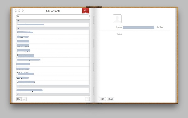
Yes, it was brought over from the iPad, and yes, it’s beautiful, but this book UI adds absolutely nothing to the user experience, and I am surprised Apple would make such a change. It does make the window larger without adding utility, though. And it isn’t like this is something we added to help make users familiar with a real-world object; when’s the last time you used a real address book? Â And not to be outdone, iCal gave itself a gratuitous face lift as well:
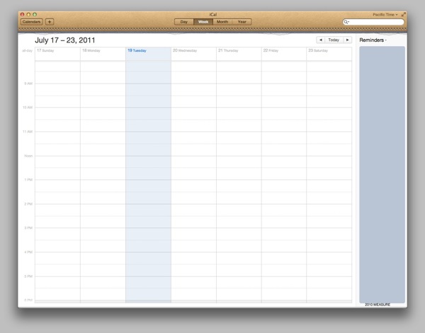
Mail was spared from having its UI made into an atrocity, and it is gorgeous:

(more on Mail later)
I can absolutely deal with the UI changes of Address book and iCal, though, because on the whole, the UI is more beautiful than it’s ever been in OS X.
Â
Not just look, but feel
Apple made some other significant UI changes that will affect your daily usage of OS X. Â They rid themselves of scrollbars, instead opting for iOS style ones, in which they are absent until you start scrolling. Â If you want to do some quick scrolling, you can then grab onto the scrollbar and drag it. Apple really invested a lot of time into making the subtleties of this right: The scrollbar will disappear after a couple of seconds but if you are moving your mouse toward it, it will stay visible so that you can reach it. Getting little things like that right enable Apple to make such a change that might seem relatively major but get away with it. Â Note that if your app uses scrollbars in a custom fashion (for instance, XCode puts marks in the scrollbar area to indicate where your compiler errors are), the app can opt to keep the scrollbar visible at all times, though it does always display in the new style (without the arrow buttons, mind you).

Another new feature that longtime Windows users will appreciate is that you can now resize an OS X window from any edge, not just the remarkably difficult to grab bottom right corner of the window.
Apple started getting gesture happy with Magic Mouse, multitouch trackpad and Magic Trackpad, but they really stepped it up in Lion. Most of Lion’s new window management techniques are able to be done by some multi-finger swipes which work great on trackpads, but not so much with the Magic Mouse (i dearly hope that improves; it’s quite bad). Â Safari in Lion added a nice new touch, allowing you to use a swipe to flip back and forth between pages, like a book. Â It feels really slick when you use it with a trackpad but is abysmal to use with the Magic Mouse. Â It works best with static web pages but can handle ones that have real-time updating (like Facebook) but there’s a bit of a delay after you flip back while it gets its footing.
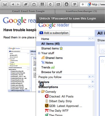
Finally, one of the first (and most jarring) things you may notice about Lion is that when you scroll, the content you’re scrolling moves in the direction you’re moving your fingers. Â It breaks a really old habit, and it was for sure annoying at first for me, but it’s absolutely a logical step forward, it reduces the cognitive overhead, and it makes your desktop behave more consistently with your iOS device. Â This can be turned off, but definitely do yourself a favor and don’t. Â You’ll get used to it after about 20 minutes. Â After an hour, you’ll become doubly confused going back to a system that does scrolling the old way.
Ready to Launch
One element that Apple has brought over from iOS is the concept of the Springboard, and it lives in Lion under the name of an app called Launchpad. Â Gizmodo complained about Launchpad because they didn’t like the fact that you had to open it, then choose to open your app. Â They then explained that it (somehow) would be less effort to just go open the app in the Finder. Â I don’t think a Gizmodo editor was Apple’s target audience with this app, though; it’s really aimed more at the new Mac users who don’t want to be bothered with understanding where their app is located; they just want to open it. For these users, it is a chore to browse to the /Applications folder and dig through that cruft and find the app. Â Now, they can just click on this one icon and they see all of the apps they own. Â It’s like a simple, focused Start menu. Â It’s not something I would ever use (I love Alfred far too much) but it’s something I would definitely see friends and relatives using. Â And it looks just gorgeous.
Â
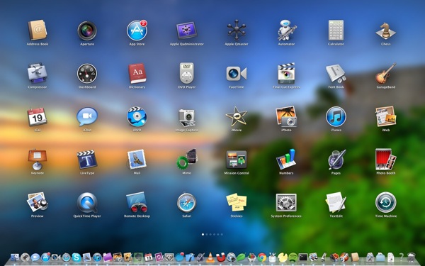
Now, Giz complained that Apple didn’t just replace the desktop with this. Â I agree that having the desktop as a place where you can keep files is a concept that needs to die (and soon), but doing what Giz suggested would have introduced a host of new concerns. Â First off, Desktop is still a very valid location where users may keep their files. Moving them on the users is going to be a tricky transition. Â Secondly, what would you do with the Launchpad when you have other apps open? How would you invoke it when you had other stuff open? Â Perhaps it might make sense for OS X to launch into Launchpad as a startup app, but even that no longer makes sense now that you can reboot your Mac and have all your programs and windows right as you left them. So Launchpad lives (quite appropriately, IMHO) as an app.
Houston, We Have Misson Control
I’ve always lauded OS X for its sophisticated tools for managing the excessive number of windows I keep open (and CAN safely keep open because OS X’s multitasking is so sophisticated).  Exposé has saved me from countless headaches.  The Dashboard has saved me from having to keep a bunch of one-use apps open on my main screen for me to see information.  And Spaces allowed me to keep groups of windows in different workspaces for easier management (I admit I don’t use that feature a lot; multiple monitors does the trick a lot better). But these multiple window management techniques are surely a bit confusing to some users (many of whom are probably surprised on reading this paragraph to learn that these even exist).  When I heard Mission Control being introduced last year I groaned, “oh, yipee, ANOTHER way to manage windows in OS X.”  But when I actually tried it out (confession: I wasn’t paying close attention to its initial demo), I realized just what it was: a brilliant unification of three different OS X window management features (and it manages fullscreen apps as well, which I’ll get to).
Â
Â
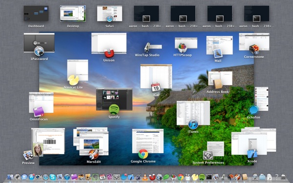
Gone is the giant mess of now illegible window thumbnails scattered about. Â I wasn’t initially crazy about the individual app windows being stacked, but it makes for better use of space, and you can easily Quick Look a window to get a peek at it by hovering the mouse over it and pressing the spacebar. Â On the top you see a view of Spaces (I only have one) as well as Dashboard. Â In Lion, all of the full screen apps are treated as their own spaces as well, and you can easily use a four-finger gesture on your trackpad to swipe left and right between these spaces. Â Naturally, you can command+tab between apps and the space will seamlessly change as appropriate.
The gestures to invoke these features are very straightforward and easy to get used to (though they are a bit customizable so I won’t post them here).
Full Screen
When it was announced initially I thought it was kind of a lame feature. I mean, full screen apps are hardly anything new, right? Games have been doing them for years. WriteRoom was written a few years ago to feed on the sudden new trend the kids were having of using only full screen apps to enhance focus. Â As someone who thrives on OS X’s ability for apps to seamlessly work with each other and ultimately allow me to do greater things because of this synergy (god, i can’t believe I just used that word), I dismissed full screen apps as a silly fad and an unnecessary attempt to bring an attribute of iOS apps to OS X (an attribute that was only there, mind you, because of iOS’s unique challenges).
The reality is that they’re kind of nice to have, especially on a smaller laptop screen. Apple has made it simple enough to switch between different apps when in fullscreen mode that I don’t really feel like I’m missing out on much of anything (though I will go into windowed mode if I need to read off of two windows at once). Â Many native Cocoa apps support going into full screen mode right out of the box unchanged (I think it depends on how the developer defined the positioning of UI elements in the .nib files; if they were defined as relative to the edge of the window, then it’s easy to determine how to make it work full screen). And some of the apps just plain look cool in full screen mode, like the Terminal app:
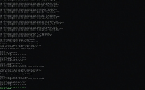
You can still do almost everything when in fullscreen mode, too. Â For instance, I was able to drag and drop an image from one full screen app to this one by both dragging and using the four finger gestures to navigate from app to app. Â It was pretty cool. Â And you have access to the Dock and menu bar in fullscreen mode as well; just move your mouse to the bottom or top of the screen and they appear.
As my memory serves me, having multiple monitors doesn’t play well with full screen mode in the one time I tried it, but your 11″ MacBook Air is going to feel a hell of a lot more useful with Lion.
Keyboard
This is one of the things I noticed randomly while using Lion, but Apple has brought over iOS’s keyboard behvior to Lion. Â You can now type accented characters using the same procedure you do it with in iOS (press and hold the base character, and a menu of accented characters will appear for you to choose). Â This might be annoying for those who depended on being able to press and hold the “u” key to get “uuuuuuuuuuuuuuuuuuuuuuuuuuuuuuuuuuuuuuuuuuuuuuuuuuuuuuuuuuuuuuuuuuuuuuuuuuuuuuuuuuuuuuuuuuuuuuuuuuuuuuuuuuuuuuuuuuuuuuuuuuuuuuuuuuuuuuuuuuuuuuuuuuuuuuuuuuuuuuuuuuuuuuuuuuuuuuuuuuuuuuuuuuuuuuuuu” but given the amount of time it took me to discover this new feature by accident, I’ll say it’s probably welcome.
In addition, iOS style AutoCorrect is now available in OS X, and it works just the same way it does in iOS (except it’s far less invasive than its mobile counterpart).
Perhaps the app that changed the most in the Lion release, Mail sports an all new look and feel (though not deviated too much from version 4). It now sports a three-column view optimized for wide screens, iPad-esque display of the message list, beautiful conversation views (a la Gmail) and the ability to archive messages with a single toolbar click (sadly Mail creates a separate Archived mailbox instead of doing the action that would, in Gmail, be the equivalent to archiving, which is moving the message to All Mail).
Conversations are finally here in desktop Mail and they’re wonderful:
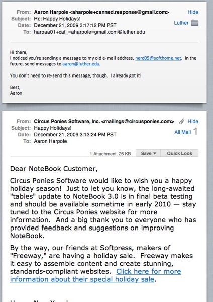
And if that didn’t make me happy enough, Apple even fixed my pet peeve bug in Mail, and now if you have rules that change the color of a message in your mailbox, they actually get their color BEFORE you click on them instead of only afterwards. Search has also been improved.
As a side note, when you set up an account in Mail now, it’s not just a Mail account. Â For instance, if I set up a Google account, Mail recognizes that and automatically configures iCal, Address Book, and iChat with these settings. Â You’ll even be prompted in Safari to configure these accounts when you first go to Gmail and sign in in Lion (a really nice touch).
Â
Performance
OS X has a reality-defying feature of consistently running faster on the same hardware than its previous version (though Leopard might be the lone exception there, though its performance was on par with 10.4). Lion is no exception. Â Boot times are much shorter and the OS in general feels incredibly snappy, especially on computers with an SSD. Â Adding to this performance increase (especially with boot) is the fact that OS X will now save the state of all the applications, so that as soon as you boot up, all of your documents and programs are just as you left them before. Â As someone who puts off reboots for weeks because it’s such a pain to close all those apps (I know, first world problems) this feature is fantastic. Â The saving of state also goes hand in hand with Lion’s new Versions feature which automatically saves documents as you work on them. Â That’s one of those features that makes you really appreciate those app developers that bit the bullet and wrote (or rewrote) their apps in Cocoa. Apps like OmniGraffle were quickly updated to add support for Versions, largely because the apps were already using Cocoa’s rich document-saving functionality. Â Though I save most of my important work in Dropbox and thus always have every revision saved, i’m really glad to see that it’s becoming a standard feature of the OS.
Â
Errata
Lion has added a ton of new features in little nooks and crannies of the OS:
-iChat now uses a unified window instead of one window per account (by far my biggest complaint with it in the past). Â It also allegedly has legit plugin support (really hoping to see real honest-to-goodness Mail plugin support at some point!)
-Finder has a new “All My Files” view that some find nifty.
-Lion adds AirDrop, which is a dead simple way to share files with other nearby people
-You can do full disk encryption instead of just encrypting your home folder.
-The Library folder is hidden now. Some consider it dumbing down, I consider it keeping things most users don’t care about out of the way.
-Quick Look bezels are no longer dark and translucent, but rather a light color. It’s rather nice.
-Lion is now a fully 64-bit OS; the early Core Duo Intel Macs need not apply.
-Java, like Rosetta, is omitted from the standard install of OS X. Â It does get downloaded when it’s first needed, though (as does Rosetta, though expect this to be OS X’s last release with Rosetta support) (EDIT: Lion doesn’t have Rosetta support; I misspoke)
Â

Leave a Reply